When you step into a restaurant, what’s the first thing that catches your eye? Is it the aroma wafting from the kitchen, the décor, or perhaps the colour scheme?
While many factors contribute to creating a memorable dining experience, the restaurant colour scheme plays a significant role in shaping customers’ perceptions and influencing their decisions.
We like our food as much as we like our interior design and build, so we know a two or thing about what it takes to get guests to part ways with their hard-earned money come payday. So, if you’re solo dining, entertain yourself as we peel back the curtain on restaurant colour schemes, exploring their psychological impact and how they consciously and subconsciously affect customer decision-making and experience.
A starter for 10 on the psychology of colour in restaurant design
Have you ever walked into a restaurant and felt something? No, we’re not talking about how hangry you are — we’ve all been there, though. We’re talking about the excitement, or the romance, or the chaos you might feel. It’s all because of colour.
The use of colour in restaurant design is not arbitrary; it’s a carefully crafted strategy aimed at creating specific atmospheres and eliciting desired emotions. Different colours evoke different psychological responses, making them powerful tools for restaurateurs to shape your guests’ perceptions.
For instance, warm colours like reds, oranges, and yellows are known to stimulate appetite and create a sense of warmth and energy. Restaurants that utilize these hues in their colour scheme often aim to create a vibrant and inviting atmosphere, ideal for casual dining experiences or lively social gatherings.
On the other hand, cool tones such as blues, greens, and purples have a calming effect and are associated with tranquillity and relaxation. Restaurants incorporating these colours may target customers seeking a more serene dining environment, perfect for intimate dinners or upscale fine dining experiences.
 Different colours create different moods
Creating a harmonious restaurant colour scheme involves more than just selecting a few appealing hues; it requires a thoughtful combination that complements the overall ambiance and reinforces the desired mood. One popular approach is to employ colour psychology principles to evoke specific emotions and enhance the dining experience.
For instance, a Mediterranean-themed restaurant may opt for a colour palette inspired by the region’s coastal landscapes, incorporating shades of azure blue, sandy beige, and sun-kissed yellow. This combination not only reflects the restaurant’s culinary theme but also transports diners to a relaxed seaside retreat, enhancing their overall enjoyment.
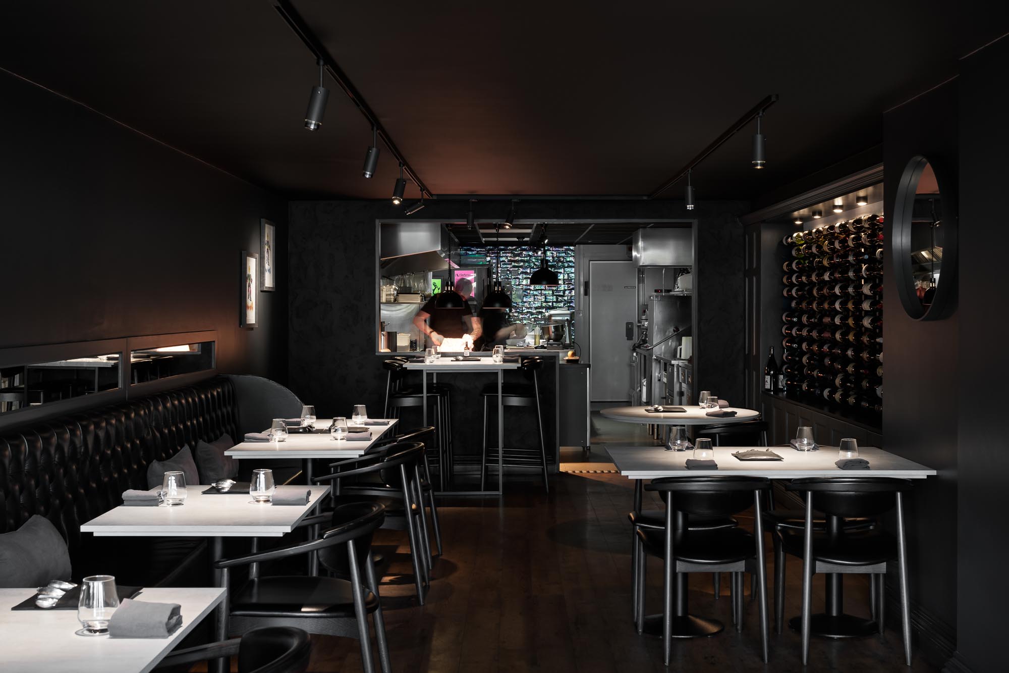
Similarly, a sleek and modern restaurant aiming for a sophisticated ambiance might embrace a monochromatic colour scheme, using varying tones of grey, black, and white to create a sense of elegance and refinement. By keeping the palette simple yet sophisticated, the restaurant cultivates an atmosphere conducive to upscale dining and luxury experiences.
 Influencing customer decision making
While customers may not always consciously register the influence of a restaurant’s colour scheme, its impact on their decision-making process is undeniable. From influencing their perception of food quality to affecting their willingness to linger and spend, colours play a crucial role in shaping the overall dining experience.
For example, research has shown that warm colours like red and orange can stimulate appetite and increase food consumption, prompting guests to order more and potentially spend more money. On the other hand, cooler tones like blue can have the opposite effect, subtly signalling to diners to eat slowly and savour each bite, leading to a more leisurely dining experience.
Furthermore, the psychological associations attached to specific colours can influence how customers perceive the restaurant’s brand identity and values. A restaurant that embraces vibrant, energetic colours may be perceived as dynamic and youthful, appealing to a more adventurous clientele. In contrast, a restaurant with a more subdued colour scheme might convey sophistication and maturity, attracting a different demographic.
 Colour is more than just a design choice
Your restaurant’s colour scheme is more than just a design choice; it’s a powerful tool that can shape customer perceptions, influence emotions, and ultimately impact business success. Whether you’re aiming to create a lively atmosphere for casual dining or a refined ambiance for upscale experiences, understanding the psychology of colour is essential.
That’s where we come in. Our interior designers know what colours will crack your customer’s codes and get them coming back for more. Get in touch today to discuss your next project.


